


Week 15 SPX Sectors Trending and Performance
I reviewed the major markets yesterday and found them to be trending quite well. We can draw whatever conclusions we want from the charts, and I did conclude there are some weaknesses. But until the price trending changes, it is basically noise. I keep reminding me that on a regular basis as I have found that easy to forget.
Summary
Only 3 sectors (XLE, XLC and XLB) are trending as well as the entire S&P 500. That is not very good (yet) as I would like to see more trending as strong as the composite. However, all the sectors are still strong so I would not say for sure there is weakness brewing. My most confident trade would be XLE long and XLRE short as of now.
Trending Heat Map

I would not call the first column amber colors to indicate signs of weakness yet. That is just price dipping below the 10-day moving average and could be transitory. Interestingly, XLRE looks the weakest among all, and I am short that.
Performance

There is some weakness in April so far as we can see that 5 of the 11 sectors have losses. Healthcare and Utilities (which are considered defensive sectors) are looking better than some others.
Here is another way of looking at it.

Note that Technology XLK, Communications XLC and Consumer Discretionary XLY are still up double digits for the year. The XLK and XLY are giving back some gains this month while XLC is still holding strong.
XLK Chart

The price got rejected at the overhead resistance once and may be trying again to break through. It is currently way above the 150-day moving average, so a pullback is likely either from current price or when it tries to breakout of the resistance.
XLE Chart
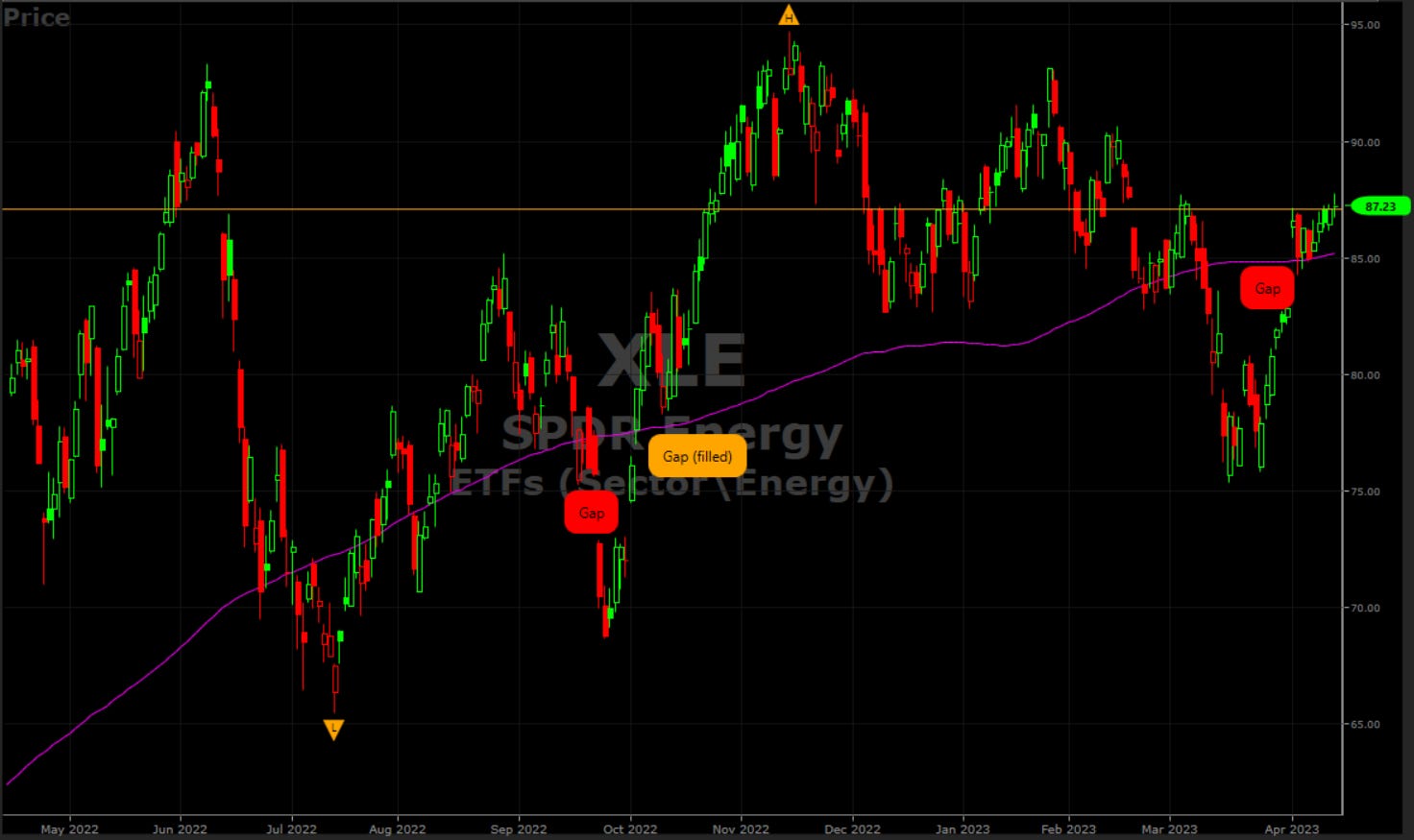
The price gapped up when the OPEC+ announcement was made and has held around that level since. The trending is bullish so price can continue to go higher. I did go long last week and took some profits. I will keep watching and trade it to the upside given some opportunities.
XLY Chart

Can price breakout from the overhead resistance? It looks like chances are low. It has failed 2 times already.
XLF Chart
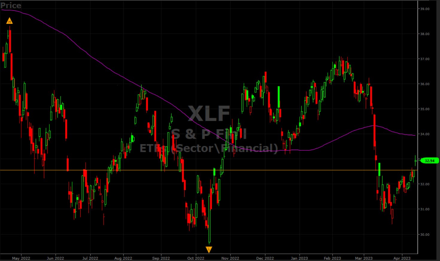
I do not know what to make of XLF. For me the trade has been on KRE (Regional Banks) to the downside ever since the banking situation.
XLRE Chart

This is the worst looking chart. We can see price got rejected at the 150-day moving average. I am currently short XLRE.