


Week 19 SPX Sectors Trending and Performance
We saw the weakness in the S&P 500 over the last several weeks and how it has not gone anywhere since April. The SPX 11 sectors that covers the overall S&P 500 gives a deeper understanding of what is working and what is not.
Trending Heat Map

Summarizing the trending:
Perfectly Bullish (3): XLP, XLK, XLC
Short-term Bullish (1): XLY
Perfectly Bearish (2): XLF, XLE
Short-term Bearish (5): XLV, XLU, XLRE, XLI, XLB
So, 7 out of 11 are trending bearish. In theory one would think the S&P 500 should be trending more bearish. However, the 11 sectors are not equal weight at all. The XLK is a huge weight and can single-handedly lead the market. In fact:
XLK has AAPL and MSFT
XLC has META and GOOGL
XLY has AMZN and TSLA
We know that these 6 stocks have been some of the big gainers in the year and have actually led the markets. Here is the sector weights table:
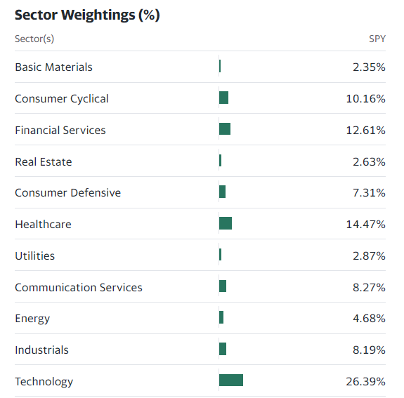
So, the bullish sectors (XLP, XLK, XLC, XLY) account for 52.13% of the S&P 500.
For most sectors, the price and the trendlines are bunched together in a kind of a squeeze. In this situation the actual trending does not matter as it can change very quickly (even several times a day). What matters is which direction the price breaks out in a meaningful way.
It sounds a bit nebulous but what it means is, be patient and let the trend to show itself emphatically. Otherwise, one could get whipsawed in both directions very quickly.
Performance

We can see that for May-to-date, we only have 2 out of the 11 sectors that are positive so far. That is the reason the S&P 500 is down a little. We are a little less than halfway through May. So, things can change by the end of the month.
To me the trend indicates weakness and more losses in the near future.
I will review some charts:
XLC chart

This is a 3+ year chart as I wanted to show the price movement around the 150-day moving average. There are 2 ways to look at the chart: 1) The price is hitting up against a resistance level that has held for a year or 2) there is an inverse head and shoulders formed and indicates upside potential.
XLK chart

Here also, we see price hitting up against resistance level that has held since last September.
XLP chart

Price hitting up against resistance.
XLU chart

Price hitting up against a well-defined downward trendline.
XLV chart

Price has checked back to the 150-day moving average. I can’t say what it will do now but we know that the trending is bearish.
XLY chart

Price has broken out to the upside from that wedge formation. There is some resistance above. But this one looks like has the best potential to move upwards.
To me, overall, the markets look weak. I am positioned to play the downside using SPY and XLI puts for now. I will likely add to that if the markets confirm the weakness further.